White Background AI Product Photo Prompts That Work
Write clearer AI prompts for white-background product photos with natural shadows, accurate materials, clean edges, and marketplace-ready compositions.
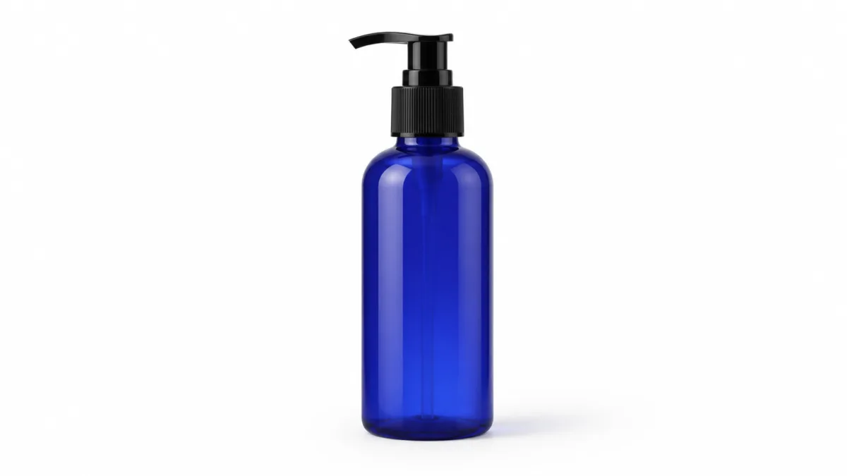
Strong AI product photo prompts for white background images must describe more than “a product on white.” Specify a seamless studio sweep, the exact product material, a useful camera angle, diffused lighting, and a restrained contact shadow. These details separate a clean commercial image from a cutout that appears to float. White-background photography is valuable because it keeps attention on shape, color, and condition, but the result still needs depth and truthful product details. Build the prompt for the intended crop, remove unnecessary props, and review edges, labels, attachments, reflections, and quantity before using the image in a listing, catalog, comparison chart, or advertisement.
Define what “white background” should look like
White can mean several different things: pure white around a cutout, a seamless paper sweep with a soft tonal transition, or a pale studio environment with a visible floor. Choose one. For most catalog work, “seamless white cyclorama with no visible horizon” gives the object a place to sit while preserving a clean field.
Also decide whether the background must reach pure white at the edges. A light gray falloff can help a white object remain visible, while a darker object may work against a brighter field. Avoid asking for “dramatic white” or other ambiguous phrases. Describe tone, gradient, and horizon explicitly.
Start with product geometry and material
The generator needs enough information to separate the product from its background. State its basic form, proportion, surface finish, and distinctive elements before describing the studio. A cylindrical matte bottle needs different highlight control from a faceted glass jar or a folded cotton shirt.
Include details customers use to identify the item:
- Number of pieces and their arrangement.
- Front, side, top, or three-quarter viewing angle.
- Color and material of the main body.
- Position of handles, caps, seams, or openings.
- Whether packaging is shown with or without the product.
If you need inspiration for clear subject-first compositions, review the product examples in the showcase and focus on hierarchy, not decorative style.
Copy this white-background prompt template
Use this copy-ready prompt as a controlled starting point:
Clean commercial studio photograph of one [product], [accurate color, material,
shape, and defining features], shown from a [camera angle] at eye-level product
height. Centered on a seamless white cyclorama with no horizon line. Broad diffused
key light from upper left, gentle fill from the right, subtle realistic contact
shadow directly beneath the product, controlled highlights, crisp natural edges,
accurate proportions, generous even margins, [aspect ratio]. No props, no hands,
no extra parts, no floating object, no gray corners, no warped label, no text added.
Replace “centered” with a precise offset if the image needs space for price or feature copy. For a group, name the exact count and arrangement rather than changing “one” to “several.”
Match lighting to the surface
A universal lighting instruction cannot handle every material. For matte products, request a broad soft key, low-contrast fill, and a gentle shadow. Glossy plastic benefits from long, controlled highlight strips that describe curvature without obscuring color. Metal needs clean gradient reflections. Clear glass needs edge definition and subtle backlighting so its outline remains visible on white.
Small reflective objects need even tighter control; the guide to handling reflections in jewelry product photos explains highlight bands, metal finish, and edge separation in more detail.
Keep the light source large and diffused when you want catalog consistency. “Hard noon shadow” may be useful for a campaign graphic, but it conflicts with the neutral purpose of a standard listing image.
Prevent the floating cutout effect
An object looks grounded when the contact point, shadow, and perspective agree. Add “subtle contact shadow directly beneath the base, darkest at contact and fading outward.” If the product is elevated by design, describe the stand or support instead of asking the model to suspend it invisibly.
Do not combine “shadowless,” “floating,” and “realistic studio photo” unless a floating montage is genuinely your goal. For most commerce images, a faint but believable shadow improves depth. The shadow should follow the declared key-light direction and should not turn into a second object.
Compose for listings and comparison grids
A listing grid looks more polished when every product uses consistent scale and margins. Define approximate frame occupancy, such as “product fills 70 percent of image height, centered with equal side margins.” Keep the camera height and angle stable across variants.
Generate square source images when multiple destinations require flexible cropping, or specify the actual channel ratio when the placement is fixed. The AI image generator lets you explore controlled versions, but choose one framing rule before producing a collection. Random shifts in scale make similar products harder to compare.
If the same product also needs lifestyle and campaign versions, return to the broader product-photography prompt framework before changing the background or prop system.
Diagnose failures and make one correction
Gray or dirty corners usually come from asking for a “moody studio” alongside pure white. Remove mood language and specify “even white to all four edges.” A disappearing white product needs a light-gray tonal separation, thin edge highlights, or a slightly off-white subject surface.
Jagged edges suggest excessive sharpness or a cutout instruction; ask for “natural optical edge transition” and a high-resolution studio photograph instead. Double shadows need one key-light direction and one contact shadow. Warped labels are a sign to simplify: protect the label area, then apply exact brand text during production design rather than expecting generated lettering to serve as final packaging art.
Keep the image commercially honest
Check the generated object against the item customers receive. A white field makes shape errors especially visible, but it can still conceal incorrect dimensions, accessories, or quantities. Never let a polished rendering imply an included stand, lid, refill, cable, or gift box that is not part of the offer.
If accurate labeling is essential, combine a verified product photograph with a controlled background workflow rather than treating generated packaging as factual. Maintain an original reference and record any compositing or retouching decisions for the person approving the listing.
Complete the pre-publish checklist
Review each candidate before export:
- The background is continuous, clean, and appropriate at every edge.
- Product count, shape, color, material, and orientation are correct.
- Base contact and shadow direction look physically coherent.
- Reflective or transparent surfaces retain readable boundaries.
- Labels, logos, seams, and attachments are not malformed.
- Frame occupancy and margins match the rest of the product set.
- No prop or accessory changes what the customer expects to receive.
- Thumbnail recognition remains strong after the final crop.
Use the template with one real product specification and generate a white-background concept. Review accuracy first, then refine lighting and margins; that order keeps a clean image useful instead of merely minimal.
Related guides
Browse all ai product photography guidesAI Product Lifestyle Photo Prompts for Believable Scenes
Build lifestyle product prompts around a real customer moment, accurate scale, product-lock details, coherent light, restrained props, and review.
How to Turn a Phone Product Photo into a Studio Image
Prepare a stronger phone reference, write a bounded studio-image prompt, protect product details, and review lighting, edges, labels, and shadows.
A Practical Seedream Product Photography Prompt Guide
Structure Seedream product photography prompts around product facts, scene choices, light, composition, constraints, and a careful review process.
Last updated .