AI Skincare Product Photography Prompts for Brands
Create polished skincare product images with prompts for accurate packaging, clean textures, ingredient-led scenes, controlled light, and campaign-ready crops.
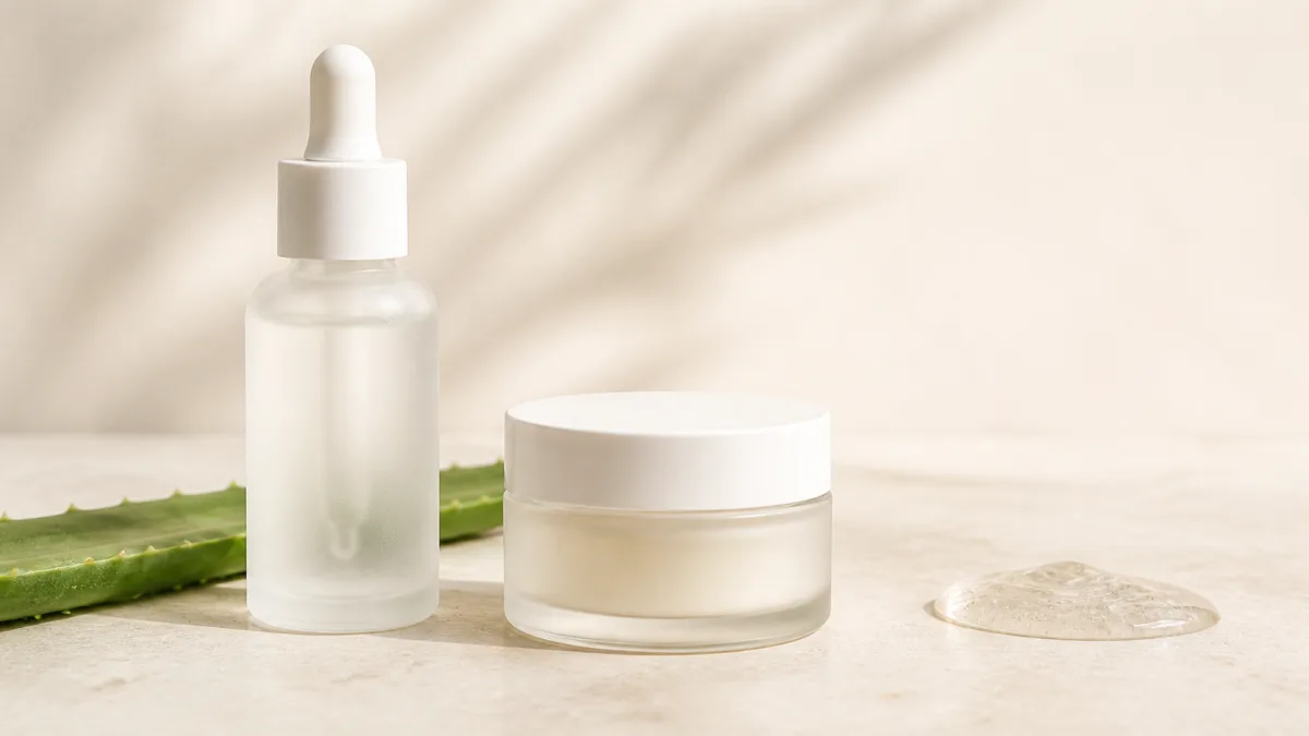
A useful AI skincare product photography prompt starts with packaging, not ingredients floating through a fantasy scene. Describe the container type, material, color, pump or cap, proportions, label area, and number of products. Then choose a clear creative idea: clinical cleanliness, sensorial texture, botanical context, or an everyday bathroom setting. Direct the light, condensation, surface, crop, and negative space around that single idea. Skincare imagery must also avoid implying unsupported results or changing what customers receive. Treat generated images as composition and campaign assets, verify every package detail against the real item, and add exact label typography from approved artwork during production rather than relying on generated text.
Define the package before the beauty mood
Skincare packaging combines small functional parts with reflective materials. Record whether the product uses an airless pump, dropper, squeeze tube, wide jar, frosted glass bottle, or opaque plastic container. Include cap color, shoulder shape, dispenser length, and relative height-to-width ratio.
State the exact count and arrangement when showing a routine. “Three products” may still invite substitutions, so name each container and its position. Keep packaging facts in the first sentence, then direct the visual environment.
Pick one message for each image
Trying to communicate purity, luxury, hydration, science, sustainability, and every hero ingredient at once creates visual clutter. Choose one message that supports the page section or campaign.
Useful directions include:
- Clean clinical scene with white tile, glass, and precise soft shadows.
- Hydration concept with controlled water texture and cool daylight.
- Botanical context using one relevant plant as a secondary prop.
- Rich moisturizer texture shown as a deliberate swipe on a separate surface.
- Calm daily-routine scene with believable bathroom or bedside context.
Browse the showcase gallery for composition references, then reduce the idea to the product, one surface, and no more than a few supporting elements.
Copy a packaging-first prompt
Use this template for a single-product advertising concept:
Premium skincare product photograph of one [container type], [accurate dimensions,
material, color, finish, cap or pump, and label-area placement], standing upright
on [surface]. [One ingredient or texture cue] placed behind and secondary to the
package. Large diffused key light from [direction], soft frontal fill, clean edge
highlights, controlled reflections, realistic contact shadow, [background palette],
[camera angle], [aspect ratio], negative space on [side] for campaign copy. Package
geometry remains exact. No extra containers, no warped pump, no invented label
text, no floating ingredients, no excessive splashes, no medical symbols.
If the product is unbranded in the concept stage, request a clean blank label panel. Add approved claims and typography later so they remain accurate and readable.
Make clean and clinical feel human
Clinical art direction does not require a sterile, empty white box. Use a restrained palette, precise spacing, clear acrylic or tile, and controlled window-like light. A subtle warm fill can prevent white packaging and skin-oriented products from feeling cold.
Keep the package facts separate from the mood by starting with this product photography prompt structure, then add only the surface and lighting choices required for the campaign.
Avoid visual shorthand that resembles medical certification unless it is factual and approved. Glass labware can become a decorative cue, but it should not imply testing, dosage, or professional endorsement. Describe surfaces and light, not unsupported authority.
Show ingredients without making claims
Ingredient props help customers understand scent, texture, or botanical context, but they can also overpromise. Use one recognizable cue at a natural scale, placed beside or behind the product. Do not show an ingredient that is absent from the formula simply because its color suits the campaign.
Separate visual storytelling from claims. “Aloe leaf beside the bottle” describes a scene; “clinically repairs skin overnight” makes a performance assertion that needs appropriate evidence and review. Keep any benefit copy outside the generated artwork and within your normal approval process.
Direct creams, gels, and water texture
Texture shots work when the prompt defines viscosity, placement, and scale. Request “one smooth pea-sized cream swipe on a small glass palette” or “a translucent gel ribbon with clean edges.” Broad words such as “splashing serum everywhere” often hide the package and produce physically confusing liquid.
Water droplets should follow gravity and the container surface. Use a small amount of realistic condensation for a fresh look, or choose a dry package for a clean catalog image. A puddle around paper packaging may tell the wrong functional story even when it looks dramatic.
If the package uses clear or frosted glass, the workflow for lighting glass perfume packaging provides a useful model for edge separation, controlled refraction, and readable labels.
Diagnose common skincare image failures
A warped pump usually means the scene is too complex or the package description is too late. Simplify the angle, move the dispenser details first, and remove overlapping props. A bottle that looks like soft plastic needs explicit material and edge-highlight instructions.
Unreadable labels should not be fixed by repeatedly asking for perfect lettering. Generate a clear, undistorted label area and composite the approved artwork afterward. Floating leaves need a surface relationship or a restrained background placement. Overwhelming foam, flowers, and droplets need a single ingredient cue and a stronger instruction that the package remains dominant.
Build a coherent launch set
Keep the same background family, key-light direction, package scale, and shadow softness across the campaign. Change crop and secondary cue according to placement. A useful set might include a square hero, a vertical ingredient story, a horizontal website banner, and a close texture detail.
Use the AI image generator to explore each format with the same packaging paragraph. Save the exact shared instructions so the collection does not drift from warm minimalism to glossy neon between placements.
Complete the skincare pre-publish check
Review every candidate against the real package:
- Container count, proportion, color, finish, cap, and pump are correct.
- Label panel is flat enough for approved artwork.
- Ingredients shown are relevant and do not dominate the product.
- Liquids, droplets, creams, and shadows behave plausibly.
- No decorative element implies unsupported certification or results.
- Props are clearly contextual, not included products.
- Crop and negative space fit the intended ad or page component.
- Exact claims, directions, and legal copy remain separate and approved.
Take one packaging description and one campaign message, then create a skincare image concept. Refine container accuracy before adding ingredients or texture; clear hierarchy will make the final art easier to trust and use.
Related guides
Browse all ai product photography guidesAI Product Lifestyle Photo Prompts for Believable Scenes
Build lifestyle product prompts around a real customer moment, accurate scale, product-lock details, coherent light, restrained props, and review.
How to Turn a Phone Product Photo into a Studio Image
Prepare a stronger phone reference, write a bounded studio-image prompt, protect product details, and review lighting, edges, labels, and shadows.
A Practical Seedream Product Photography Prompt Guide
Structure Seedream product photography prompts around product facts, scene choices, light, composition, constraints, and a careful review process.
Last updated .