How to Choose AI Product Photo Background Ideas
Choose product photo backgrounds by material, audience, placement, contrast, and brand mood, then turn the direction into a precise image prompt.
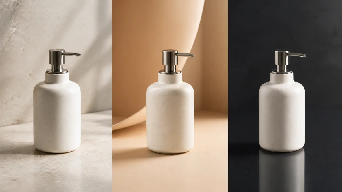
Useful AI product photo background ideas begin with the product's material, customer, and final placement rather than a fashionable aesthetic. A background must create enough contrast to reveal the silhouette, support believable reflections and shadows, and leave room for the layout. Start from an accurate product reference, decide what cannot change, and test one background family at a time. Pale stone, seamless paper, natural wood, soft fabric, colored acrylic, and contextual interiors each solve different problems. The aim is not to hide a weak source photo beneath decoration; it is to build a scene where the real product remains the clearest and most trustworthy element.
Start with contrast and edge readability
Place a light product against a surface that separates its outline without producing a harsh cutout. Dark glass may need a brighter rim or gradient behind it. A reflective metal object needs controlled shapes to reflect. A patterned product usually benefits from a quieter field.
Check the background as a small thumbnail. If the product disappears when reduced, extra detail will not solve the issue. Simplify the value, color, or texture relationship first.
Match the surface to the material
The surface determines the contact shadow and reflection, so it should make physical sense.
- Seamless paper: clean catalog work and easy color control.
- Limestone or concrete: restrained texture for cosmetics, home goods, and accessories.
- Pale wood: warmth for handmade, kitchen, or natural products.
- Fabric: softness for apparel, jewelry, fragrance, or gifting.
- Acrylic or glass: polished reflections for technology and beauty concepts.
- Real interior: context for furniture, decor, and lifestyle goods.
Review visual combinations in Showcases, then choose one family that complements the actual material.
Connect the background to the buyer and placement
A product-page hero favors clarity and flexible cropping. An advertisement may use stronger color and directional light. A retailer thumbnail needs immediate silhouette recognition, while an email banner needs negative space for a headline.
Write the placement and audience into the brief. "Wide launch banner for a minimalist home fragrance customer" is more actionable than "premium background." It tells the generator why the composition needs space and restraint.
Use color with a specific role
Background color can create separation, signal a collection, or support a seasonal campaign. It should not falsify the product's own color. For accuracy-critical catalog images, use neutral light and a controlled surface. For campaigns, a complementary or closely related hue can be effective if the product remains true.
Avoid describing five colors and multiple gradients in one prompt. Pick a dominant background color, a small accent, and a neutral if needed. This keeps the scene easy to art-direct across a series.
Build depth without adding clutter
Depth can come from a horizon line, soft gradient, pedestal, shadow, or one blurred contextual layer. It does not require a room full of props. A pedestal makes small products feel intentional; a gentle wall-to-floor curve creates a catalog studio; a distant window blur suggests lifestyle context.
Decide which depth cue is doing the work. Too many layers can produce inconsistent perspective and pull attention away from the product.
Ten adaptable background directions
Use these as starting points rather than fixed recipes:
- Warm white seamless with a faint natural shadow.
- Pale limestone with a soft cream wall.
- Charcoal-to-black studio gradient with controlled rim light.
- Natural oak tabletop in quiet window light.
- Muted brand-color paper sweep with no visible corner.
- Frosted acrylic platform over a matching color field.
- Textured linen with relaxed, shallow folds.
- Bathroom shelf with a softly blurred tile background.
- Kitchen counter with one relevant ingredient family.
- Abstract geometric pedestal with generous negative space.
Copy-ready product background prompt
Use the uploaded image as the exact product reference for [product]. Preserve its shape, proportions, color, material, finish, label, logo, text, and all identifying details. Change only the environment. Place the unchanged product on [surface] against [background treatment] for a [placement] aimed at [audience]. Use [camera angle] in [aspect ratio], with [light type] from [direction], controlled reflections appropriate to [material], a natural contact shadow, and clear edge separation. Add [one depth cue or restrained prop family] and leave negative space on [side] for layout. Do not redesign the product, alter packaging, invent text, add extra products, create impossible reflections, hide the base, distort perspective, or add a watermark.Try variations in the AI image generator, then use the creation workspace for the direction that best fits the actual placement.
Why background changes fail
Floating products usually lack a defined surface or contact shadow. State both. Incorrect reflections happen when the prompt names a glossy material but no surrounding light or environment for it to reflect. Describe a broad softbox, window, or dark flag shape rather than asking for generic shine.
If the background changes the product color, remove colored light and request neutral illumination on the product with color confined to the environment. If labels warp, simplify the camera angle and repeat preservation instructions at the beginning. If props multiply, specify an exact maximum or remove them entirely.
Compare ideas with a controlled test
Keep the same source image, crop, camera, product scale, and lighting logic while changing only the background family. Compare pale stone, seamless paper, and one contextual scene. Judge edge clarity, material credibility, layout space, and brand fit rather than novelty alone.
Once a direction wins, document the surface, background color, light direction, shadow softness, and crop margin. That short standard makes future product images easier to align.
Pre-publish background checklist
- Product geometry, color, material, label, and logo match the source.
- Background contrast makes the complete silhouette easy to read.
- Surface, contact shadow, perspective, and reflections agree physically.
- Environmental color has not contaminated the product itself.
- Props support the use case and do not imply unsupported contents.
- Negative space fits the real headline, crop, or interface placement.
- The background remains coherent at thumbnail and full-resolution sizes.
- No invented text, badges, prices, claims, or duplicate products appear.
Pick one background family that solves a real layout problem, adapt the prompt, and open Create. Keep the product lock fixed while changing one environmental decision at a time.
Related guides
Browse all ai product photography guidesAI Product Lifestyle Photo Prompts for Believable Scenes
Build lifestyle product prompts around a real customer moment, accurate scale, product-lock details, coherent light, restrained props, and review.
How to Turn a Phone Product Photo into a Studio Image
Prepare a stronger phone reference, write a bounded studio-image prompt, protect product details, and review lighting, edges, labels, and shadows.
A Practical Seedream Product Photography Prompt Guide
Structure Seedream product photography prompts around product facts, scene choices, light, composition, constraints, and a careful review process.
Last updated .