Good AI image prompts for Pinterest pins plan a vertical visual around one promise and one focal subject. Define the article, product, recipe, or idea the pin leads to; choose a 2:3 canvas; reserve a simple area for a headline; and keep important objects away from the extreme edges. Vertical Pinterest image prompts should generate the visual foundation, while exact headlines, logos, and calls to action are added later in a layout tool. This keeps spelling reliable and lets the same original image support several truthful headline tests without repeatedly generating the entire pin.
Start with the destination, not the decoration
A pin should visually prepare the user for the page that opens after a click. Write down the destination's specific value first: a beginner balcony herb guide, a small-entryway storage tutorial, or a checklist for photographing handmade candles. The image should show that subject honestly rather than promising a result the page does not provide.
Convert the promise into one visible scene. For a step-by-step guide, show the finished outcome with a small hint of process. For a product article, feature the actual type of product in a relevant setting. For a list post, use a representative arrangement rather than stuffing every list item into one frame.
Compose for a tall 2:3 frame
Pinterest commonly displays vertical creative, and a 2:3 image is a practical starting canvas for standard pins. Confirm current platform guidance before publishing. Composition still matters more than merely naming the ratio. Divide the frame into a focal zone and a copy zone. Place the subject in the lower two thirds when the headline will sit above it, or shift the subject to one side when a narrow text column is planned.
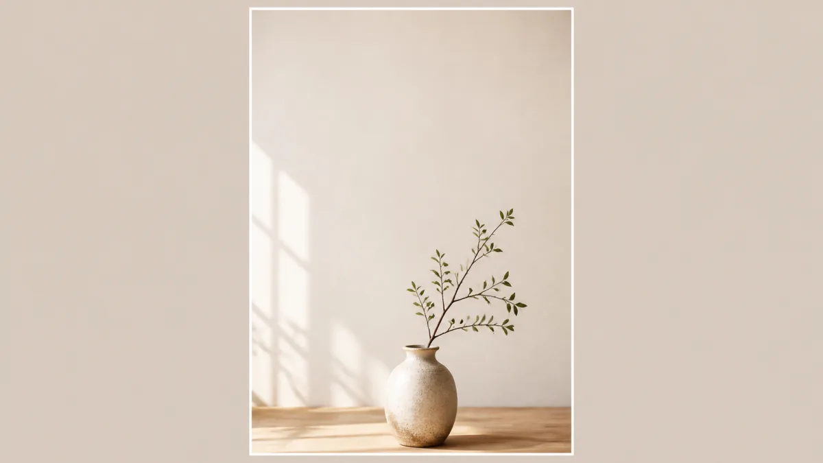
Ask for clean breathing room, not a literal blank rectangle. A softly lit wall, calm sky, blurred countertop, or restrained paper texture can hold type without feeling disconnected from the scene. Keep the main face, product, or completed project inside a central safe region so small platform crops and responsive layouts do not remove its defining features.
Make the focal subject readable on a phone
Pins are often seen as small cards. Use a simple silhouette, clear value contrast, and limited supporting props. A distant person in a busy room may disappear; a closer crop of the relevant action communicates faster. For a tutorial image, show hands only when their anatomy and action can be checked carefully.
Specify the camera view that best explains the subject. Overhead works for flat lays, recipes, and craft materials. Three-quarter views reveal depth in rooms, products, and plated food. Eye level can make a person or finished object feel direct. Do not combine incompatible views in one prompt.
Prompt pattern for an editorial pin image
Create an original vertical Pinterest image for a page about [specific topic
and truthful benefit]. Show [one clear subject or finished outcome] in [simple
relevant setting], viewed from [camera angle]. Compose in a 2:3 aspect ratio
with the subject placed [lower center / lower right / left third] and a calm,
low-detail area in the [upper third / right side] for a headline to be added
later. Use [one lighting source] from [direction], a restrained palette of
[colors], natural shadows, and clear separation between the subject and
background. Keep essential details within the central safe area and readable
at thumbnail size. No text, letters, logos, buttons, watermarks, clutter,
duplicate objects, cropped focal features, or misleading before-and-after.
Build the base visual in the AI image generator, then add approved copy and branding outside the generator.
Fix pin images that do not read quickly
If the subject disappears at thumbnail size, move closer, remove props, and increase separation from the background. If headline space is noisy, replace objects with a calm surface or gentle light gradient. When the image feels unrelated to the click destination, return to the page promise and show its actual outcome. Make a corrected base in Create before adding typography.
Three practical pin directions
For a recipe pin, describe the exact dish, serving vessel, recognizable ingredients, camera angle, and truthful portion. Use overhead or a close three-quarter view, with a simple table area for the title. Do not invent ingredients that are absent from the linked recipe.
For a home project pin, show a plausible finished space with the relevant constraint visible. A "small entryway" image should not quietly become a large designer foyer. Keep the layout achievable and avoid fictional product labels or precise performance claims.
For a checklist or educational pin, use one symbolic but specific scene. A content-planning checklist might show a clean desk with a blank calendar grid and simple tools, leaving headline space above. Do not generate tiny fake writing; add labels during layout.
Add headlines after generation
Choose a short headline that matches the destination page. Set it with a readable font, strong contrast, and enough padding from edges. A subtle solid panel or gradient behind type can be more reliable than forcing letters across a detailed photograph. Keep branding present but secondary.
If you test multiple headlines, use the same base image when the promise remains the same. This isolates the copy difference and maintains visual consistency. Do not imply test results without measurement, and do not publish a design as a "winner" based only on personal preference.
Create a repeatable visual system
A series benefits from fixed rules: aspect ratio, headline position, type scale, logo placement, corner radius, image treatment, and two or three brand colors. Vary the subject and supporting palette only as needed. Consistency should help recognition without making every pin look duplicated.
Save a text-free master image and the editable layout separately. This makes it easier to correct wording, adapt a headline, or create a new crop without degrading the generated visual. Review examples in Showcases for ways to keep a vertical composition focused.
Pinterest image review checklist
- The image accurately represents the linked page.
- One subject remains clear at mobile thumbnail size.
- The 2:3 composition includes a calm, deliberate copy area.
- Faces, hands, products, food, and repeated objects are believable.
- The added headline is spelled correctly and does not cover the focal point.
- Essential content stays away from vulnerable outer edges.
- Contrast remains readable on both bright and dim displays.
- Logos, claims, and calls to action were added and reviewed manually.
- The file uses an appropriate format and dimensions for the publishing workflow.
The strongest AI image prompts for Pinterest pins do not attempt to generate an entire advertisement in one pass. They create an original, accurate, vertically composed visual with space for a deliberate layout. That division gives you more control over clarity, brand consistency, and the promise attached to every click.