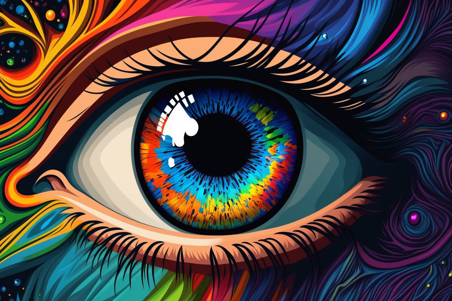

Effective AI event poster prompt examples generate the visual system, not the final event information. Define the event type, audience, mood, one visual metaphor, hierarchy, palette, and deliberate copy zones. Ask for a text-free image, then add the verified title, date, venue, price, sponsor marks, and accessibility details in a layout tool. Event poster design prompts should support information rather than bury it in decoration. This workflow gives you control over spelling, alignment, contrast, and last-minute schedule changes while preserving an original visual direction that belongs to the event.
Turn the event brief into one visual idea
Begin with factual details: event category, subject, audience, venue context, season, and tone. Then write one visual premise. A neighborhood night market could use overlapping illuminated awnings seen from below. An experimental music event could use a single vibrating geometric form. A botanical workshop could center on layered leaf silhouettes and tactile paper shapes.
Avoid mixing several metaphors. "Futuristic retro organic cyberpunk collage" gives the generator no clear hierarchy. Choose a dominant idea and let color, texture, and supporting forms reinforce it.
Map the information before generating
List every text element the final poster needs. Common groups include event name, short descriptor, date and time, venue, booking or entry detail, organizer, and required partner logos. Rank them by importance and sketch approximate zones.
Describe those zones as low-detail areas in the image prompt. Reserve the top for a title, the lower section for logistics, or one side for a vertical information rail. Do not ask the model to render the real wording. Generated letters are unreliable, and a beautiful image with no usable information space is not a poster system.
Choose a visual hierarchy that survives distance
One form should dominate from across a room or in a small listing thumbnail. Supporting patterns can reward a closer look, but they should not compete with the title. Use contrast in scale, value, direction, or color to establish order.
State whether the poster is portrait, square, or landscape based on its confirmed placement. Print vendors, ticketing pages, and social surfaces may need separate exports. Check their current dimensions and bleed requirements before production rather than assuming one universal poster size.
Example: community night market
Create a text-free portrait event-poster visual for a friendly neighborhood
night market. Main visual metaphor: a rhythmic canopy of four glowing fabric
awnings viewed from slightly below, forming a welcoming path toward the center.
Bold simplified shapes, warm amber, tomato red, deep navy, and cream palette,
subtle paper texture, strong silhouette readable at thumbnail size. Reserve a
calm dark upper band for the event name and a low-detail cream area at the
bottom for date, venue, and access details. Keep all illustrated objects away
from trim edges. No words, letters, logos, sponsor marks, crowds, branded
stalls, photographic faces, watermark, or mockup.
Example: independent film screening
Create an original text-free portrait poster visual for an independent film
screening about memory and place. Center one translucent doorway containing a
quiet coastal horizon, surrounded by a deep charcoal field with restrained
silver grain. Minimal editorial composition, precise geometry, one small coral
accent, generous negative space above and below. Leave the upper third clean
for the film title and the lower quarter simple for screening details and
credits. No camera icons, film reels, text, faces, existing movie references,
logos, awards, ratings, or watermark.
Example: hands-on botanical workshop
Create a text-free 4:5 poster illustration for a practical botanical printing
workshop. Arrange three distinct leaf silhouettes and one carved printing block
in a clear diagonal composition, with visible handmade ink texture and two flat
colors: forest green and muted clay on warm paper. Keep the center-left as the
main visual and reserve a clean right column for the workshop title and a calm
bottom band for date and venue. Original shapes, accessible contrast, no tiny
details. No words, fake handwriting, hands, logos, duplicate leaves, photographic
effects, border, mockup, or watermark.
Explore one direction in the AI image generator and compare how different focal shapes read in Showcases.
Add accurate typography and event details manually
Import the selected visual into a layout tool. Set the exact title and logistics with fonts you are licensed to use. Establish a clear type scale, align related information, and keep sufficient contrast against the image. Proofread names, dates, time zones, addresses, prices, URLs, and access information with the organizer.
Add sponsor or venue logos only from official supplied files, respecting their clear-space rules. Do not approximate them with generated marks. If details may change, keep the layout editable and avoid embedding logistics into the image master.
Fix common poster-generation failures
If the visual overwhelms every copy zone, simplify the background and request one large shape rather than more empty wording like "space for text." If the result looks generic, replace style adjectives with an event-specific metaphor, materials, and palette. If the hierarchy disappears at thumbnail size, remove small motifs and strengthen the dominant silhouette.
Unwanted fake letters often appear when words such as "poster," "ticket," or "sign" imply typography. Repeat "text-free visual foundation" and exclude letters, numbers, signs, and logos. Crop only after confirming that the new frame still protects the planned type areas.
Prepare print and digital versions
For print, ask the printer for current trim size, bleed, safe margin, color profile, resolution, and accepted file format. Extend background art through the required bleed while keeping text and logos inside the safe margin. Inspect gradients and dark tones in a proof when possible.
For digital delivery, export separate ratios rather than shrinking a print poster into every social slot. Recompose the visual and type while retaining the same metaphor, palette, and hierarchy. Use the Create workspace to make a clean alternate visual when a radically different frame is needed.
Event poster delivery checklist
- The image expresses one idea connected to the real event.
- Title and logistics have protected, low-detail zones.
- Every event detail was entered and proofread manually.
- Fonts, images, and logos are approved for use.
- The focal shape reads at both poster and thumbnail size.
- Contrast and information order are clear.
- Print bleed, safe area, and file requirements were confirmed with the vendor.
- Digital variants were checked in their current publishing surfaces.
Choose one visual metaphor and one primary poster placement, then adapt the closest prompt in Create. Build the final information layer only after the image works without invented lettering or unsupported event claims.