
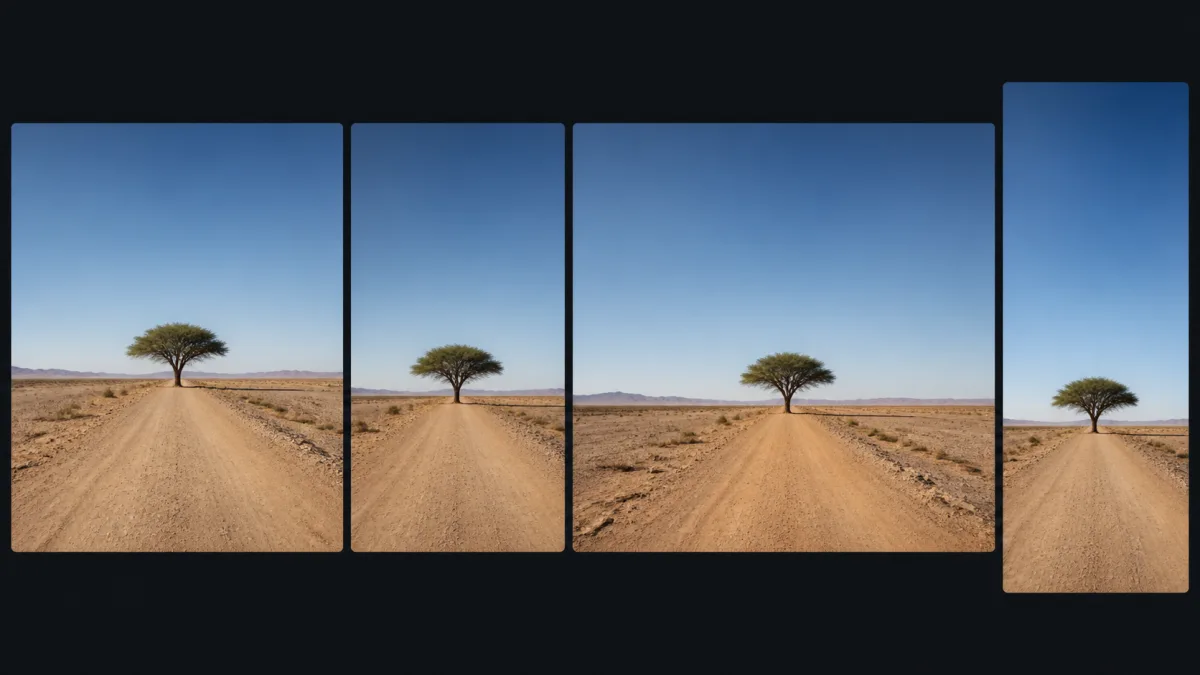
This AI image aspect ratio guide starts with placement, not a supposedly universal format. The best aspect ratio for AI images is the frame that fits the final surface while giving the subject enough room, protecting essential details from cropping, and supporting any nearby copy or controls. A square is useful for balanced cards, a landscape frame suits wide presentation areas, and a portrait frame supports tall editorial or mobile placements. Treat ratio as a composition decision made before generation. Changing it later can remove context, shrink the focal point, or require the model to invent new scenery.
Understand what a ratio actually controls
An aspect ratio describes the proportional relationship between width and height, not the final pixel count or image quality. A 1:1 image can be small or large; it remains square. A 16:9 image is wider than it is tall, while 9:16 uses the same proportional relationship turned vertically.
Ratio determines how much horizontal or vertical story space the composition can use. It influences subject scale, horizon placement, negative space, and how many secondary elements can remain readable. Resolution is a separate export decision. Choose composition first, then create the dimensions and file format required by the destination.
Use 1:1 for balanced, interchangeable cards
Square framing works well when images appear in equal grid cells, profile tiles, catalog cards, or reusable social assets. It supports centered subjects and symmetrical arrangements. It also adapts reasonably to circular crops when important features stay near the center.
The limitation is directional space. A runner, vehicle, gaze, or long product may feel cramped. If the final interface uses a narrow horizontal card, a square source may be cropped too aggressively. Use 1:1 when consistency and balanced subject scale matter more than environmental breadth.
Use 4:5 or 3:4 for portraits and editorial cards
Moderately vertical formats provide height without the extreme constraints of a full-screen phone frame. They suit people, fashion, artwork previews, posters without embedded text, and content cards that need a strong subject plus some environment.
A 4:5 frame can keep a standing person prominent while leaving room for posture and clothing. A 3:4 frame allows slightly more vertical context. Confirm the exact slot used by your site or publishing tool; similar-looking cards can still crop differently. Keep faces and defining objects away from the outer edge.
Use 3:2 or 4:3 for natural landscape coverage
These landscape ratios work for editorial photography, presentations, galleries, product context, and scenes that need a modest amount of environment. They are less panoramic than 16:9, so the subject can remain relatively large.
Choose 3:2 when a photographic frame feels appropriate and 4:3 when you need a little more height for rooms, food, groups, or foreground depth. The names alone should not make the choice; preview both inside the real page component and compare the resulting focal scale.
Use 16:9 for wide screens, video covers, and heroes
A 16:9 frame provides clear horizontal space for landscape scenes, presentation covers, video thumbnails, and many website media areas. It can support a subject on one third and a text region on the other, but only if that layout is included in the initial prompt.
Wide does not mean "add detail everywhere." A simple light gradient, wall, sky, desk surface, or depth layer may create more useful copy space than extra objects. Check mobile behavior: a desktop hero may crop toward the center or switch to a different image, so a separate mobile composition can be safer than forcing one file to do both jobs.
Use wider cinematic ratios only when the destination supports them
Frames such as 2:1 or 2.39:1 can emphasize scale, travel, architecture, or cinematic staging. They also create significant edge area and make centered subjects smaller. If the display container is not equally wide, the image will be letterboxed or cropped back toward a common landscape frame.
Choose an ultrawide ratio when the final canvas truly uses it, not simply because "cinematic" sounds attractive. Place visual weight across the frame and verify that important elements survive realistic trimming.
Treat 9:16 as a dedicated mobile canvas
A full vertical frame supports phone-first stories, reels, shorts, and certain full-height presentations. It is not merely a landscape image rotated. The composition must use vertical depth, keep a readable focal path, and reserve room for interface overlays. Check the current platform safe zones before export because controls and recommendations can change.
Fix crops that fail across multiple formats
When a crop cuts off the subject, shrinks it beyond recognition, or removes all copy space, the original frame was asked to serve incompatible placements. List every required use, mark the most restrictive crop, and note where text or controls appear. Similar formats such as 4:5 and 1:1 may share a roomy master. A set containing 16:9 and 9:16 usually needs distinct compositions instead of one severe crop.
Keep subject identity, palette, lighting, and art direction consistent across versions. Recompose the scene for each frame. A person can move from the left third in a horizontal hero to the lower center in a vertical story while still belonging to the same campaign.
Add ratio and layout purpose to the prompt
Create a [subject and scene] for [specific placement] in a [ratio] aspect
ratio. Position the main subject [location] at [relative scale], with [amount
and type of negative space] on [side] for [copy or interface need]. Keep
[essential facial, product, or story details] inside the central crop-safe
region. Use [camera view], [single light source], and [simple background depth].
The image must still read when displayed at [card / hero / presentation]
size. No text, logos, watermark, edge clutter, duplicate subjects, or cropped
defining features.
Compare candidate framing in Showcases, test the chosen frame in the AI image generator, and use Create for alternate compositions rather than repeatedly stretching one result.
Aspect-ratio decision checklist
- The exact destination and container are known.
- The ratio supports subject direction and required context.
- Planned copy or controls have deliberate space.
- Important details survive the destination's crop behavior.
- Subject scale remains useful at the final display size.
- Separate horizontal and vertical compositions are planned when necessary.
- Pixel dimensions, file size, and format will be chosen after composition.
- Every version keeps consistent identity and art direction.
There is no single best aspect ratio for AI images. Choose the frame that solves the placement, then write the subject position and crop constraints into the prompt. That simple decision prevents many problems that cannot be fixed cleanly after an image has already been composed.